

Project:
Growens Group redesign 2023
In the summer of 2023, I was tasked with redesigning the employee branding and careers section of the Growens Group’s website, as well as developing a stylebook for all of their on-screen communications.
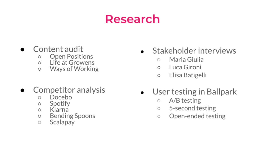
After a long process of research, both internally and competitive analysis, and interviews with stakeholders, I developed prototypes for the careers section. Those prototypes were then tested, indicating that user experience was improved with my redesign. Simultaneously, I got the opportunity to develop the style guide with two content design teammates. These are the results of my work.
The first order of business was showing users how to use the site to guide them to a new job within the tech group. I created an overview page to map out the steps involved.
The 3 sections that I was to incorporate in the process were already built to explain the culture of Growens, open position listings and their guide to remote work. But the language was translated from italian and needed a lot of touching up.


The Life at Growens section, highlighting the culture of the tech group, had a lot of clunky messaging. It was too long and needed to be simplified. I wanted to use language that was both helpful and inclusive. I incorporated the company’s own internal culture blog, titles Stories, to highlight the environment of the Growens. I attempted to keep the language consistent with the professional voice, while crafting ways to feel welcoming to new blood.
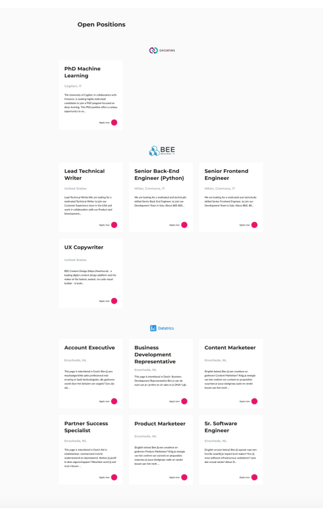
The open positions listings were a different challenge. The original clickable job listings [pictured at the left] weren’t well organized. There were too many words on the screen. And honestly it was just ugly.
I created a clickable prototype [pictured at the right] that included only crucial information: the position, the location, and the company within Growens Group with the opening. The clickable prototype shows the simple layout and minimal verbiage.


Though I wasn’t tasked with creating a 404 page for the Growens Group, I noted that they didn’t have one and included this is my deliverables. On a search for photos the company could use, I had found an actual photo of a locked door with the 404 room number highlighted in Growens Group’s signature pink. I knew I had to use it.
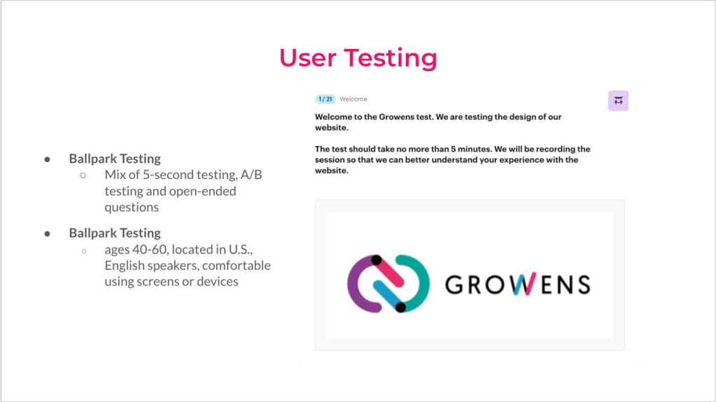
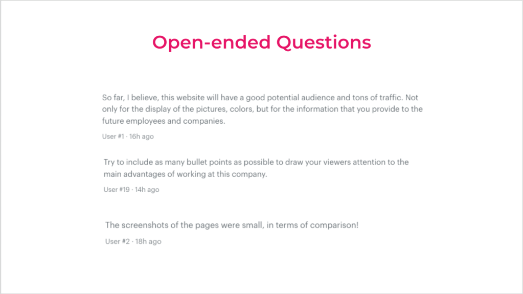
Using Ballpark for user testing, I was able to run the prototypes omn the sort of users who Growens stakeholders said they were looking for. For each test, users were tested for their ability to comprehend and navigate between the original screens for the Growens site and the prototypes I’d created. Over 70% of users found the rework to be easier to understand and use.


With a team of 2 others, I helped craft the first ever content style guide for Growens Group. In all honesty, I really loved the process. We looked at other stylebooks used in similar tech industry groups – like Microsoft and Spotify. We knew we wanted language to be clear, concise and inclusive. We wanted stakeholders to understand that creating consistency across all of the Growens content platforms was crucial to communication. After all, Growens is a marketing and communications tech group.
Though there wasn’t much consistency in their voice, it was clear that they were very professional. So no matter the tone, the voice needed to stay trustworthy and buisnesslike. Whether the messaging was to be inviting, open or informing, it still needed consistency.
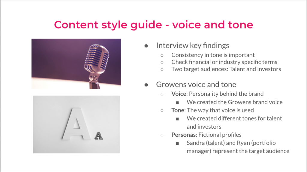

The messaging needed to be clear and quickly understood. We also created a glossary of terms specific to Growens, so that writers across all platforms could have a concrete definitions to use for words that may be unclear to some readers.
