UX WRITING ACADEMY PROJECTS 2023
Here are a few things I created while learning at the UX Writing Academy, founded by Yuval Keshtner’s UX Writing Hub.
Design Goals: GorillaBox
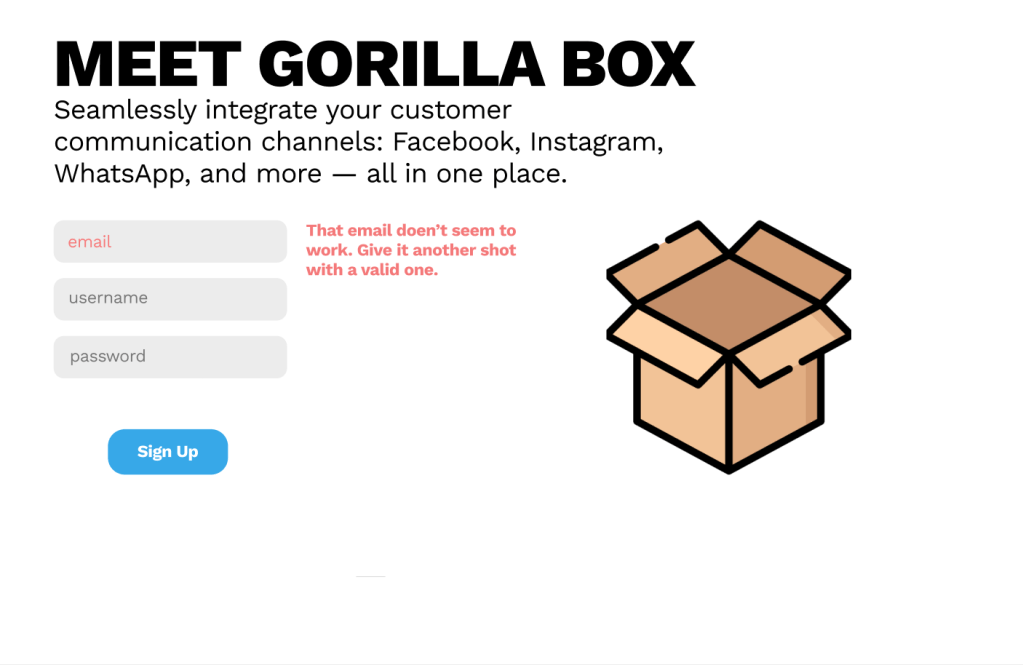
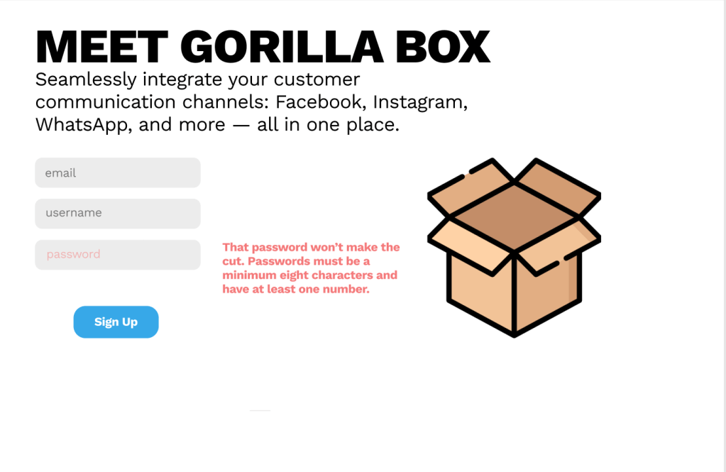
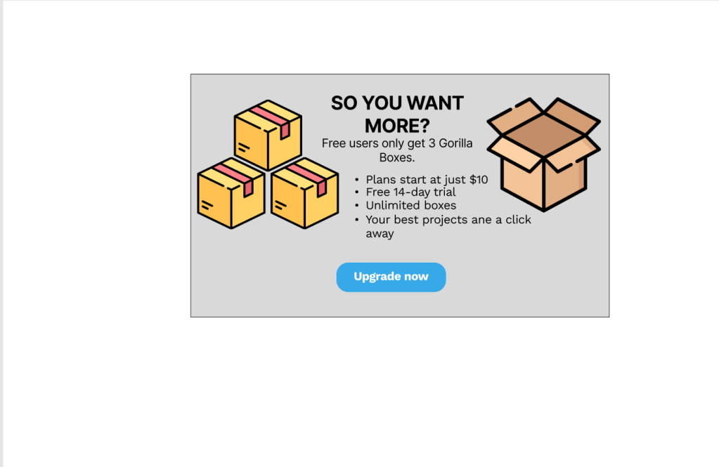
One of the first projects they gave us was to create error messages for a onboarding in GorillaBox, a fictional company that integrates social media communication channels so that clients can have consistent messaging across platforms. I created these simple lo-fi prototypes to show error message for the typical issues users have when signing up for a product: formatting an email address incorrectly, a password or username incorrectly. The tone was to be friendly and helpful. The other task was to create a prototype of a popup that would show users how to upgrade to a premium paid account.
Design Goals: Lingual, toast and pop-ups
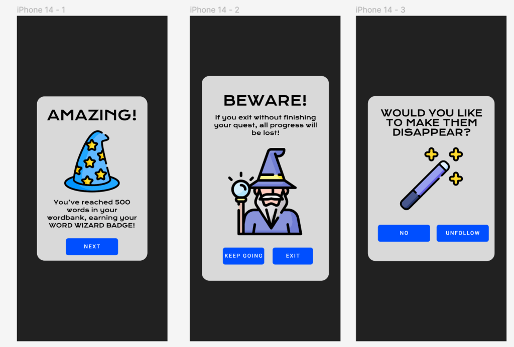
One of the more enjoyable UX Writing Academy projects I created was a set of pop-ups and toast for a language learning app. Lingual was an app similar to Duolingo, but the theme is a wizard’s quest. The project was to use wizardly language and imagery to keep users engaged in a fun, productive manner. The project reminded me of three major pieces of media that played a part in my childhood: Disney’s The Sword in the Stone,The Legend of Zelda and the animated feature The Hobbit that Ian Rankin, Jr. made in 1977. The simple 8-bit imagery of Hyrule and the lines delivered by Merlin and Gandalf all still resonated with me and served as some of my inspiration.
While the voice was that of a guiding wizard, the tone would change to suit the need of the screen. The first screen designed [pictured top left] was to show when users had earned a badge for accomplishing a milestone in the app. The second was to instruct users to finish a task before quitting or their progress would not be saved. The third box was to delete a follower on the social side of the app.
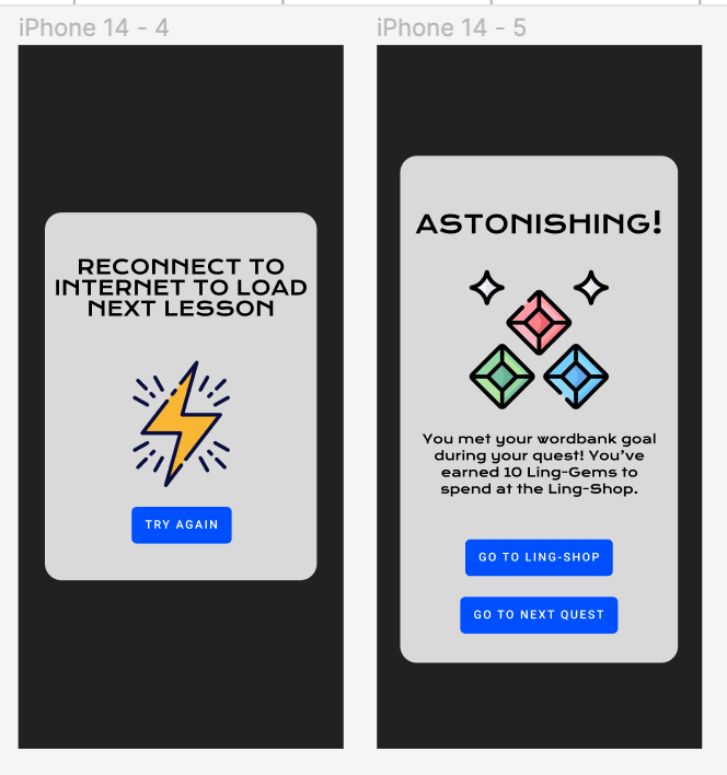
To tell users that they need to reconnect to the internet [bottom left] I felt like a more direct approach would fit the needs of the tone better. That was an issue that needed immediate attention and a clear instruction. By comparison, the last screen was a pop up explaining the game. Users would earn gems as tokens for their accomplishments in the quest, based on their language learning and proficiency. Those gems could be spent within the game for new features.
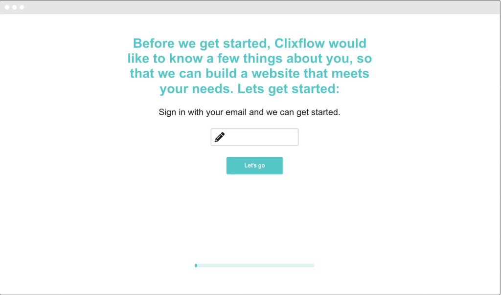
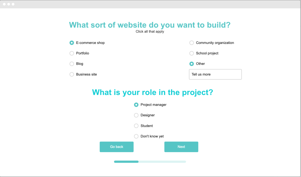
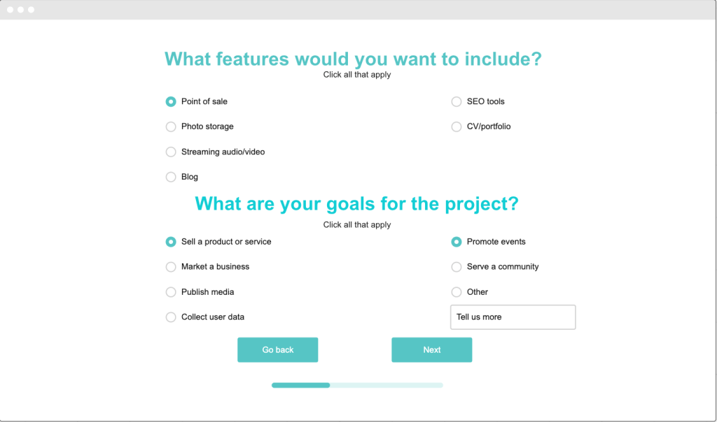
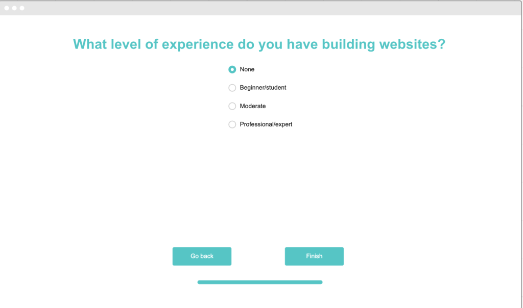
Design Goals: Clixflow
For this project I was asked to design a signup page for Clixflow, a fictional WYSIWYG website builder. The goal was to present users with a 4-6 screen to collect data, helping users build the type of website they want. My messaging is clear, but businesslike. The concept was to create a form all users could work through comfortably, whether they’re trying to start a fundraiser for a charity, create a website for their law practice or sell their hip-hop mixtape online. Users need guidance and this form is intended to put users on the path to creating a great finished product.